
我希望有一个div部分,尽可能多地填充其div父级,同时保持一个比率。
渲染结果如下所示:
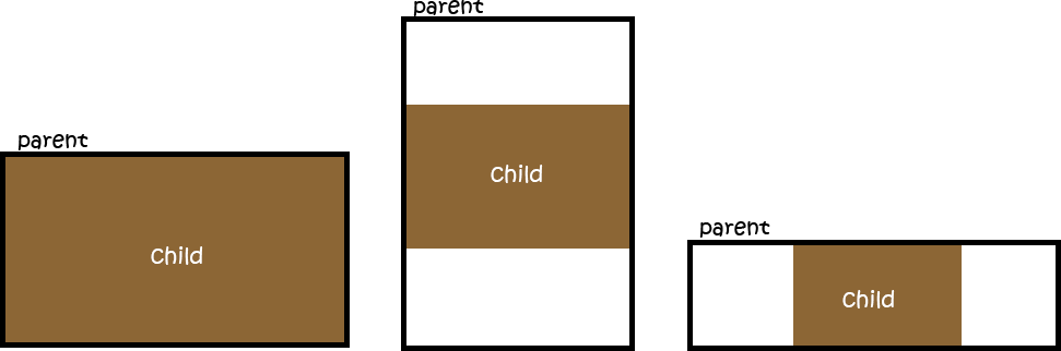
到目前为止我所拥有的:
html,
body {
  height: 100%;
}

.parent {
  /* Parent's height and width are unknown,
     it could be dynamic, e.g. parent is part of a flex layout. */
  height: 80%;
  width: 90%;
  border-style: solid;
  border-width: 2px;
  border-color: black;
}

.child {
  width: 90vw;
  /* 90% of viewport vidth */
  height: 50.625vw;
  /* ratio = 9/16 * 90 = 50.625 */
  max-height: 90vh;
  max-width: 160vh;
  /* 16/9 * 90 = 160 */
  margin: auto;
  position: absolute;
  top: 0;
  bottom: 0;
  left: 0;
  right: 0;
  background: #A0522D;
}
<div class="parent">
<div class="child">
content that is not images...
</div>
</div>这个css的行为就像我想要的方式,但是这是使用视口而不是父div,这在实际情况下是一个问题。
我正在寻找一种方法来填补基于父div。
使用纵横比:16/9;溢出:隐藏(纵横比MDN文档)应该可以提供您想要的准确结果,而无需使用填充技巧。确保父级设置为显示:栅格,否则可能无法正确缩放。
除了Safari,所有主要浏览器(caniuse.com)都支持宽高比CSS属性,尽管Safari计划今年增加支持。这是实现这种效果的最佳/正确方法,而不必求助于JavaScript或任何黑客解决方案。
堆栈溢出的相关问题和答案:
html, body { height: 100%; }

.parent {
  display: grid;
  resize: both;
  height: 50%;
  width: 90%;
  border: 2px solid #000;
  overflow: hidden;
}

.child {
  width: 100%;
  max-height: 100%;
  margin: auto;
  aspect-ratio: 16 / 9;
  overflow: hidden;
  box-sizing: border-box;
  position: relative;
  background: #a0522d;
  text-align: center;
  font-size: 20px;
  color: white;
  /* using the below to center the text, optional */
  display: flex;
  align-items: center;
  justify-content: center;
}
<div style="padding: 5px 10px; margin-bottom: 10px; background: #f00; color: #fff; text-align: center; z-index: 1;">Resize the block below using the resize controls to see this in action.</div>
<div class="parent">
<div class="child">content that is not images...</div>
</div>
也许添加位置绝对和它的工作原理,通过设置顶部,右,底部,左到0与边距自动.你也可以使用flex居中它或绝对与左50%和变换-50%太。
body {
            padding: 0;
            margin: 0;
            height: 100vh;
            width: 100vh;


        }

        .child {
            width: 90vw;
            /* 90% of viewport vidth */
            height: 50.625vw;
            max-height: 90vh;
            max-width: 160vh;
            /* Adding this maybe min-width and min-height */
            min-height: 90vh;
            min-width: 160vh;

            /* 16/9 * 90 = 160 */
            background: #f7f7f7;
            box-shadow: 0px 5px 30px 0px rgba(0, 0, 0, 0.18);
            border-radius: 4px;
            margin: auto;
            position: absolute;
            top: 0;
            left: 0;
            right: 0;
            bottom: 0;
        }
<!DOCTYPE html>
<html lang="en">
<head>
<meta charset="UTF-8">
<meta http-equiv="X-UA-Compatible" content="IE=edge">
<meta name="viewport" content="width=device-width, initial-scale=1.0">
<title>Parent Child</title>
</head>
<body> <!-- parent -->
<div class="child"></div>
</body>
</html>
使用flexbox和padding。使用媒体查询确定视口的最小纵横比。然后进行相应的调整。
html,
body {
  height: 100%;
}

.parent {
  height: 100%;
  width: 100%;
  border-style: solid;
  border-width: 2px;
  border-color: black;
  /* to center */
  display: flex;
  align-items: center;
  justify-content: center;
}

.child {
  width: 100vw;
  /* 16:9 aspect ratio = 9 / 16 = 0.5625 = padding-bottom*/
  padding-bottom: 56.25%;
  background: #A0522D;
}

@media (min-aspect-ratio: 16/9) {
  .child {
    height: 100vh;
    /*16:9 aspect ratio = 9 / 16 = 177.77 = width*/
    width: 177.77vh;
    padding: 0;
    margin: 0px;
    background: red;
  }
}
<div class="parent">
<!-- the viewbox will provide the desired aspect ratio -->
<div class="child">
content that is not images...
</div>
</div>