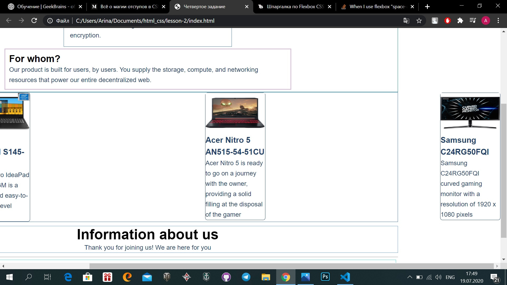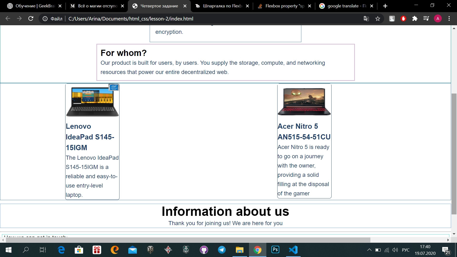

我遇到了一个麻烦,我有三张卡片,我需要它们在页面的中心,块必须有相同的缩进。 我决定用Flexbox。 在这里,第三个在右边,我有一个卷轴:


这是我的html代码和这些块的css,有人能告诉我我做错了什么吗?
null
<!DOCTYPE html>
<html lang="en">

<head>
    <meta charset="UTF-8">
    <meta name="viewport" content="width=device-width, initial-scale=1.0">
    <link rel="stylesheet" href="./style.css">
    <title>Четвертое задание</title>
</head>

<body>
    <div class="container">

        <div class="menu-container">
            <h1 class="main-header">Menu</h1>
            <div>
                <a href="index.html">Main page</a>
            </div>
            <div>
                <a href="./contacts/contacts.html">Contacts</a>
            </div>
        </div>

        <main>
            <div class="main-container">
                <div class="reasons">
                    <h2>Why do we do this?</h2>
                    <p class="paragraph">What was built to be the ultimate platform for the free sharing of knowledge
                        has
                        turned
                        into a money-hungry
                        monster feasting on our privacy and freedom.</p>
                    <p class="paragraph">But fear not, we have the answer! And it’s simple: An autonomous peer-to-peer
                        network
                        featuring
                        distributed storage powered by universal compression, accelerated scheduling allocation, and
                        end-to-end
                        encryption.</p>
                </div>

                <div class="product-info">
                    <h2>For whom?</h2>
                    <p class="paragraph">Our product is built for users, by users. You supply the storage, compute, and
                        networking
                        resources that
                        power our entire decentralized web.</p>
                </div>
            </div>
            <div class="what-we-do">
                <div class="card">
                    <img class="photo-card" src="./img/1stcard.jpg" alt="laptop">
                    <h4 class="fourth-head">Lenovo IdeaPad S145-15IGM</h4>
                    <p class="paragraph">
                        The Lenovo IdeaPad S145-15IGM is a reliable and easy-to-use entry-level laptop.</p>
                </div>

                <div class="card">
                    <img class="photo-card" src="./img/2ndcard.jpg" alt="laptop">
                    <h4 class="fourth-head">Acer Nitro 5 AN515-54-51CU</h4>
                    <p class="paragraph">
                        Acer Nitro 5 is ready to go on a journey with the owner, providing a solid filling at the
                        disposal of the gamer</p>
                </div>

                <div class="card">
                    <img class="photo-card" src="./img/3dcard.jpg" alt="monitor">
                    <h4 class="fourth-head">Samsung C24RG50FQI</h4>
                    <p class="paragraph">Samsung C24RG50FQI curved gaming monitor with a resolution of 1920 x 1080
                        pixels</p>
                </div>
            </div>
        </main>


    </div>
</body>

</html>
null
null
.what-we-do{
    border: 1px solid #356EAD;
    display: flex;
    justify-content: space-between;
}

.what-we-do .photo-card{
    width: 150px;
    height: 100px;
}
.card{
    height: max-content;
    border: 1px solid #1F3F68;
    border-radius: 6px;
}
null
提前感谢!)
尝试给what-we-do div宽度:100%