
我正在尝试对齐一个div内的项目,我读了一些问题,但仍然有这个疑问。
我目前拥有的:
代码是
null
.wrapper {
border: 1px solid black;
width: 50%;
display: flex;
align-items: center;
}
.image {
border: 1px solid green;
}
.title {
border: 1px solid blue;
margin-left: 1%;
}
p {
border: 1px solid red;
float: right; /* Does not work */
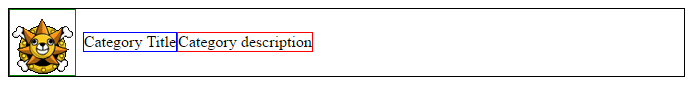
}<div class="wrapper">
<span class="image">
<img src="http://opae.a-superlab.com/forum/styles/art_air/imageset/forum_read.png">
</span>
<span class="title">Category Title</span>
<p>Category description</p>
</div>null
类别描述的float:right不起作用:(我希望它位于块的最右侧。
将margin-left设置为显式长度不是一个选项,因为“类别描述”的内容是可变的。
这是因为您使用的是flexbox,因此float会被忽略,如规范中所述:
>
在概述中:
Flex布局表面上类似于块布局。它缺少许多可以在块布局中使用的更复杂的以文本或文档为中心的属性,如浮点和列。
在柔性容器中
float和clear对flex项没有影响,也不会使其脱离流。但是,float属性仍然可以通过影响display属性的计算值来影响方框生成。
在Flex项示例中
<div style="display:flex">
    <!-- flex item: floated element; floating is ignored -->
    <div id="item2" style="float: left;">float</div>
</div>
但是,如右对齐flex项?中所述,在flexbox中,您可以使用margin-left:auto将flex项向右推送:
null
.wrapper {
  border: 1px solid black;
  width: 50%;
  display: flex;
  align-items: center;
}
.image {
  border: 1px solid green;
}
.title {
  border: 1px solid blue;
  margin-left: 1%;
}
p {
  border: 1px solid red;
  margin-left: auto;
}
<div class="wrapper">
<span class="image">
<img src="http://opae.a-superlab.com/forum/styles/art_air/imageset/forum_read.png">
</span>
<span class="title">Category Title</span>
<p>Category description</p>
</div>