
使用线性渐变很容易在CSS中创建彩虹。
#grad1 {
  height: 200px;
  background: linear-gradient(45deg, red, orange, yellow, green, blue, indigo, violet, red);
}
<div id="grad1"></div>但是看看它!这种渐变在美学上是可怕的。它有条纹,endpoint交汇处有丑陋的纯色条纹,循环不太好,不光滑,当它们无缝融合时,颜色明显相互对比。
简而言之:这是一个可怕的梯度。
我想找到完美的渐变。一种以光滑、平滑的方式包围彩虹的渐变,一种不会留下任何明显的颠簸或视觉撕裂的渐变。这种渐变不是尖尖的混乱,而是一条平滑的曲线。
这个梯度是否存在?
您需要选择能够很好地融合在一起的颜色和更多的颜色步骤。
background: linear-gradient(90deg, rgba(255,0,0,1) 0%, rgba(255,154,0,1) 10%, rgba(208,222,33,1) 20%, rgba(79,220,74,1) 30%, rgba(63,218,216,1) 40%, rgba(47,201,226,1) 50%, rgba(28,127,238,1) 60%, rgba(95,21,242,1) 70%, rgba(186,12,248,1) 80%, rgba(251,7,217,1) 90%, rgba(255,0,0,1) 100%);
.rainbow-box {
    width: 80vw;
    height: 200px;
    border-radius: 5px;
    background: linear-gradient(
        90deg,
        rgba(255, 0, 0, 1) 0%,
        rgba(255, 154, 0, 1) 10%,
        rgba(208, 222, 33, 1) 20%,
        rgba(79, 220, 74, 1) 30%,
        rgba(63, 218, 216, 1) 40%,
        rgba(47, 201, 226, 1) 50%,
        rgba(28, 127, 238, 1) 60%,
        rgba(95, 21, 242, 1) 70%,
        rgba(186, 12, 248, 1) 80%,
        rgba(251, 7, 217, 1) 90%,
        rgba(255, 0, 0, 1) 100%
    );
}
<div class="rainbow-box"></div>
你可以通过叠加红色、绿色和蓝色来获得看起来更好的东西,试图匹配人类颜色锥的敏感性。
这是一个例子,但是它可以通过调整线性渐变中的一些%数字和具有窒息的渐变形状(目前带有截止顶部的三角形)来改进。
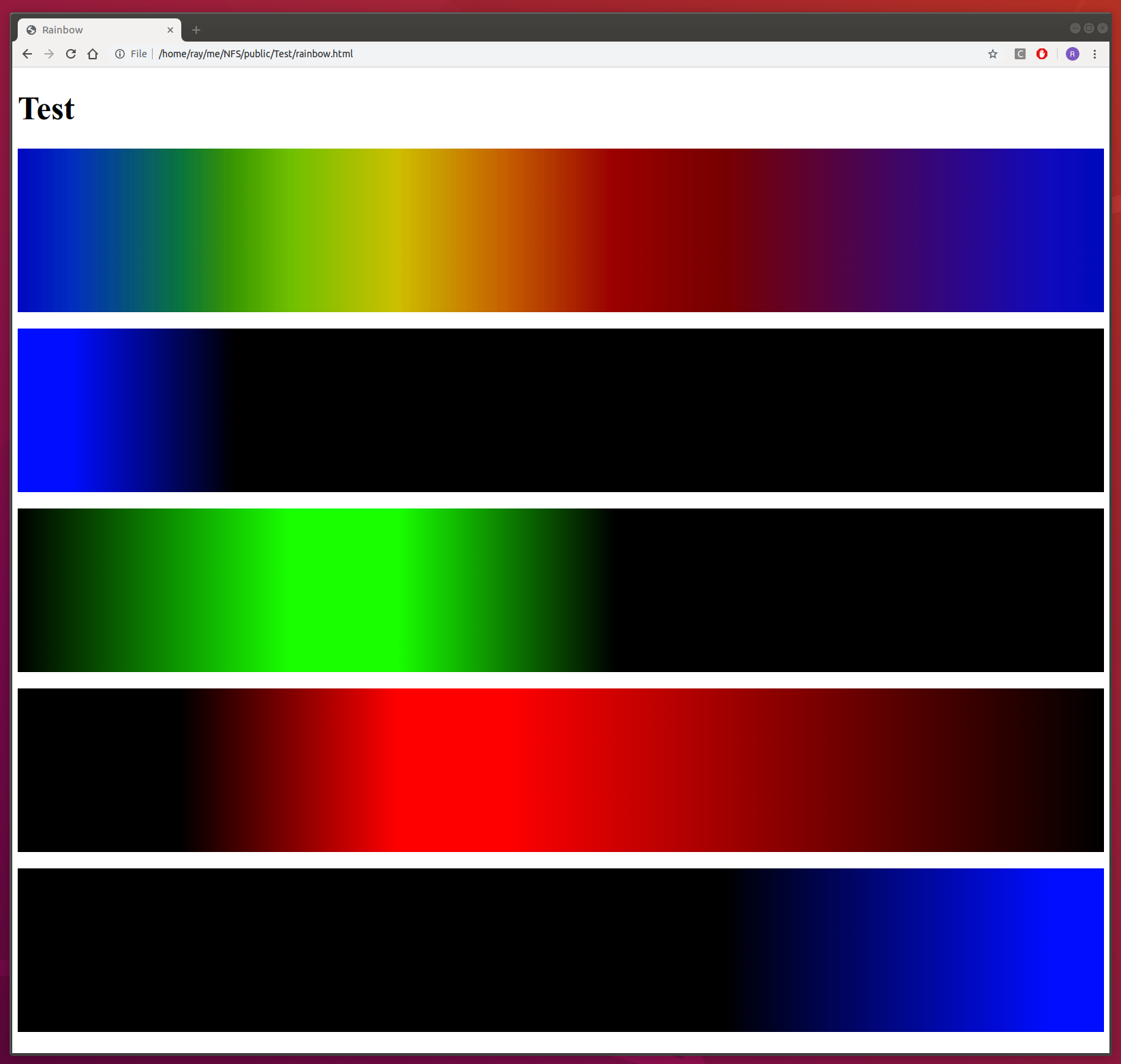
<!DOCTYPE html>
<html>
<head>
    <title>Rainbow</title>
    <meta charset="UTF-8" />
    <style>
        * { box-sizing: border-box; }

        .separate   { width: 100%; height: 10em; }
        .separate>* { width: 100%; height: 100%; margin-top: 1em; }

        .overlay   { width: 100%; height: 10em; filter: brightness(3); }
        .overlay>* { width: 100%; height: 100%; position: absolute; }
        .overlay>:nth-of-type(1) { opacity: 1; }
        .overlay>:nth-of-type(2) { opacity: .5; }
        .overlay>:nth-of-type(3) { opacity: .33; }
        .overlay>:nth-of-type(4) { opacity: .25; }

        .blue   { background: linear-gradient(
           90deg,                 rgb(0,0,256)  0%, rgb(0,0,256) 5%,  rgb(0,0,0) 20% ); }
        .green  { background: linear-gradient(
           90deg, rgb(0,0,0) 0%,  rgb(0,256,0) 25%, rgb(0,256,0) 35%, rgb(0,0,0) 55% ); }
        .red    { background: linear-gradient(
           90deg, rgb(0,0,0) 15%, rgb(256,0,0) 35%, rgb(256,0,0) 45%, rgb(0,0,0) 100% ); }
        .blue2  { background: linear-gradient(
           90deg, rgb(0,0,0) 65%, rgb(0,0,256) 95%, rgb(0,0,256) 100% ); }
    </style>
</head>
<body>
<h1>Rainbow</h1>
    <div class="overlay">
        <div class="blue"></div>
        <div class="green"></div>
        <div class="red"></div>
        <div class="blue2"></div>
    </div>
    <div class="separate">
        <div class="blue"></div>
        <div class="green"></div>
        <div class="red"></div>
        <div class="blue2"></div>
    </div>
</body>
</html>
"彩虹"或"色轮"通常被称为色调。
CSS具有hsl()函数(代表色调,饱和度,亮度)。
要创建渐变,只需将360度的色调度除以12种主要颜色(=30度)。
在色调上应用30度的增量:
#hue {
  height: 40px;
  background: linear-gradient(90deg,
    hsl(0, 100%, 50%),
    hsl(30, 100%, 50%),
    hsl(60, 100%, 50%),
    hsl(90, 100%, 50%),
    hsl(120, 100%, 50%),
    hsl(150, 100%, 50%),
    hsl(180, 100%, 50%),
    hsl(210, 100%, 50%),
    hsl(240, 100%, 50%),
    hsl(270, 100%, 50%),
    hsl(300, 100%, 50%),
    hsl(330, 100%, 50%),
    hsl(360, 100%, 50%)
  );
}
<div id="hue"></div>