
我一直到这里。

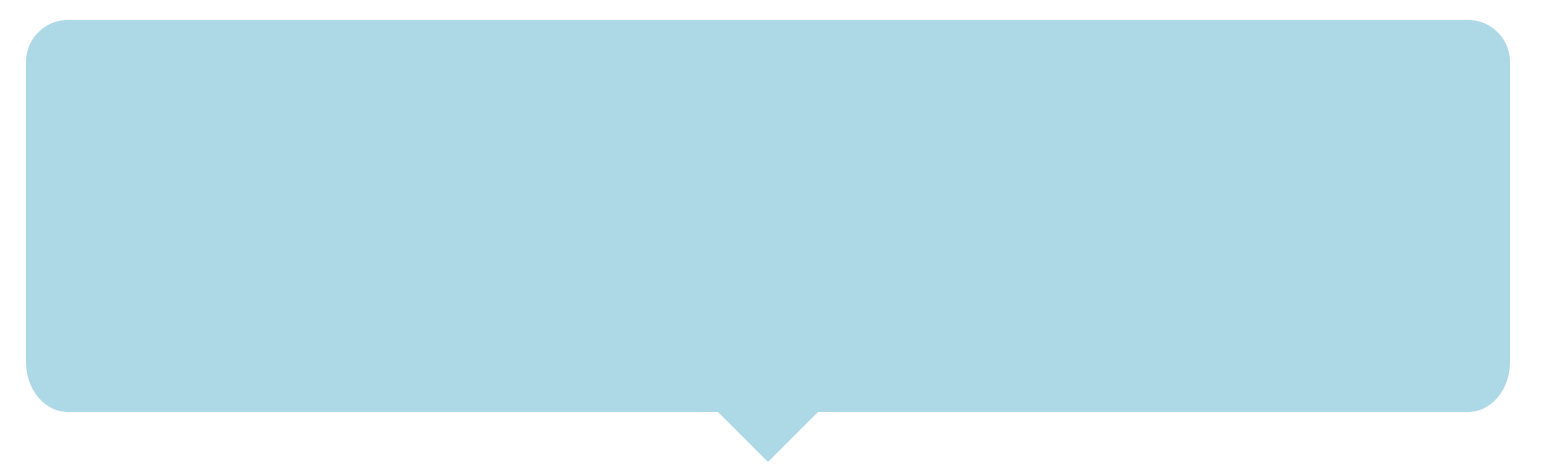
底边如何曲线?感谢任何帮助。
  div class="curved-message"/>

.curved-message{
    background: 'lightblue';
    clip-path: polygon(0% -20%, 100% 0%, 100% 90%, 56% 90%, 52% 100%, 48% 90%, 0% 90%);
    border-radius: 25px;
    margin-top: 250px;
    height: 345px;
    border-top: 4px solid white;
    border-left: 4px solid white;
    border-right: 4px solid white;
    max-width:750px;
}
也许另一种方法?
null
.curved-message {
  position: relative;
  width: 300px;
  height: 100px;
  background: lightblue;
  border-radius: 15px;
}
.curved-message:before {
  content: "";
  width: 30px;
  height: 30px;
  background: lightblue;
  position: absolute;
  bottom: -15px;
  left: 50%;
  -webkit-transform: translateX(-50%) rotate(45deg);
  transform: translateX(-50%) rotate(45deg);
}
<div class="curved-message">
</div>